


Your website works.
It loads.
Your buttons work.
Your contact form works.
Your logo is there.
So why does the whole thing still feel...
cheap?
Here's the uncomfortable truth: A website can be technically good and still look terrible.
And your visitors don't need to know anything about web design to notice. They feel it. Within seconds, they form an impression of your business. They decide whether you look established or amateur, premium or ordinary, trustworthy or questionable. And sometimes, they leave without ever being able to explain why.
The problem usually isn't that you need a "better website." It's that your website is sending the wrong visual signals. Here's why.
1. Your Typography Looks Like an Afterthought
Typography is one of the fastest ways to make a website feel expensive—or cheap.
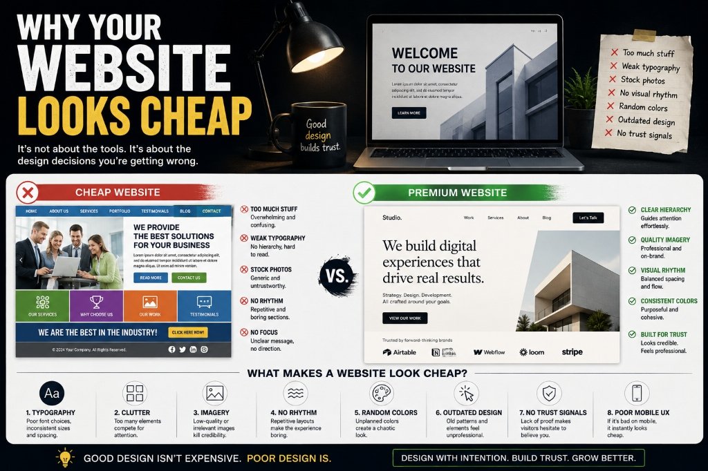
If you're using one generic font everywhere, random font sizes, weak hierarchy, huge blocks of text, poor line spacing, or inconsistent weights, your website immediately feels less considered.
Compare these two approaches:
Cheap approach
BIG TEXT. Some normal text. More normal text. A button. Another heading. Everything is roughly the same size and weight.
Premium approach
A deliberate type hierarchy: One strong headline, supporting copy with controlled width and spacing, small labels, clear section headings, and consistent body typography.
The difference isn't necessarily the font itself; it is how the typography is composed. Premium design creates hierarchy. It tells your visitor exactly where to look first, what to read, and what action to take.
2. You Have Too Much Stuff on the Screen
This is one of the biggest mistakes businesses make. They think they need to show everything. So the homepage gets three banners, five buttons, eight services, testimonials, logos, a giant paragraph, a popup, a chatbot, social links, a newsletter form, and multiple CTAs.
Congratulations, you've created visual noise.
Premium websites understand that whitespace is not wasted space. Whitespace gives important elements room to breathe. Look at luxury brands: they don't need to fill every pixel. They show less, but what they show receives more attention.
If you want your website to feel premium, stop asking "What else can we add?" and start asking: "What can we remove?"
3. Your Images Look Cheap
Imagery can destroy an otherwise good website. You can have beautiful typography, a sophisticated layout, and excellent development. Then you put a random stock photo of five people in suits smiling around a laptop, and suddenly the entire brand feels generic.
Your imagery should feel like it belongs to your business. That might mean professional custom photography, carefully selected editorial photos, custom illustrations, or art-directed visual systems.
The important thing isn't the price of the image; it's the art direction. Your images should share a visual language with similar lighting, composition, color treatment, and tone.
4. Your Layout Has No Visual Rhythm
Imagine listening to a song where every beat has exactly the same intensity. It would become exhausting. Websites work similarly: you need rhythm. A strong website moves between large and small, dense and spacious, visual and textual, interactive and quiet to create pacing.
Instead, many websites look like a repetitive sequence of: Section → Text → Button. It technically works, but it feels like a document, not an experience.
Premium websites use changes in scale, spacing, alignment, color, typography, and motion to direct attention.
5. Your Colors Don't Have a System
Another classic mistake is using your brand colors everywhere (e.g., purple button, blue heading, green section, orange card, red notification, and gradient background). Suddenly your brand looks like a PowerPoint presentation.
A strong visual identity has a controlled palette: a dominant primary color, a selective secondary, an accent reserved for important moments, and consistent neutrals for backgrounds, text, and borders. The goal is intentionality. When everything is highlighted, nothing is.
6. Your Buttons Look Like Buttons From 2012
Buttons are small, but they communicate a lot. A generic, unstyled "CLICK HERE" button can instantly make a modern website feel outdated.
Think about shape, padding, contrast, hover states, and copy. Compare a generic "SUBMIT" button with a modern "Book a Consultation →" link. The second tells the user what happens next. Buttons should respond to interactions with fluid, subtle transitions to create perceived quality.
7. Your Navigation Is Doing Too Much
Your navigation doesn't need to link to your entire business. If your menu has Home, About, Services, Products, Portfolio, Blog, Resources, Pricing, Careers, Contact, and Login all crammed together, visitors won't know what to click.
Good navigation makes the decision obvious. Your most important destinations deserve the attention; everything else can be secondary or tucked away. Help visitors find what matters.
8. Your Website Looks Like Everyone Else's
This is probably the biggest problem. Using the exact same hero layout, the same three cards, the same stock photos, the same SaaS template, and the same footer makes your site completely unmemorable. If I remove your logo, can I still tell it's your website?
A premium website needs recognizable design decisions, whether it is distinctive typography, a custom illustration style, editorial layouts, or a signature color system. You need something that makes the visitor pause.
9. Your Animations Are Either Missing—or Annoying
Motion can make a website feel alive, or it can make it feel like a cheap theme park if everything bouncily flies in, spins, slides, and zooms at once.
Good motion has a purpose: it guides attention, explains relationships, and makes transitions feel natural. The best animations are simple, fast, and fluid, making the user experience feel polished without screaming for attention.
10. Your Spacing Is Inconsistent
People feel spacing issues even if they can't explicitly point them out. If one section has 120px of padding, the next has 37px, the next has 82px, nothing feels connected.
Good design establishes consistent spacing rules. This creates visual relationships and builds visitor confidence because the website feels designed rather than randomly assembled.
11. Your Content Doesn't Sound Like Your Brand
Your website can look beautiful and still feel cheap if the copy is generic, like: "We provide high-quality solutions to help businesses achieve their goals." This statement is meaningless.
Compare it with: "We build digital storefronts for restaurants that turn Google searches into direct bookings." It is specific, clear, and memorable. Write copy with a distinct voice, and ensure your visual and verbal identities align.
12. Your Website Doesn't Show Proof
Looking premium isn't enough; people need reasons to trust you. Instead of saying you're experts, show client results, detailed case studies, numbers, awards, and recognizable client logos. A premium website establishes clear authority.
13. Your Footer Gives Away the Game
You spent hours designing the homepage, then reached the bottom only to show a tiny, cramped copyright block as an afterthought. The footer is part of the experience. Treat it with proper spacing, clean typography, consistent colors, and structured navigation links. The last impression matters.
14. You're Designing for Yourself
You know your business inside out, so you think everything is obvious on the page. Your visitor doesn't. Your website should be designed entirely around the visitor's questions: What is this? Is it for me? Why should I care? Can I trust you? What should I do next? Good design is communication.
15. You Don't Have a Design System
A design system defines typography, spacing rules, colors, buttons, cards, and forms. Without a system, every section becomes a new inconsistent design decision. With a system, the entire website feels like one coherent, premium object.
So What Actually Makes a Website Look Expensive?
It isn't more flash, gradients, or animations. It is intentionality. Everything feels like it was chosen for a reason—nothing feels accidental.
A cheaper website asks "What sections do we need?" and "Which template should we use?". A premium project asks "What experience should the visitor have?" and "What visual language should represent this brand?". Focus on intentional, deliberate decisions.
Related ResourcesFree Press Release Templates (2026)30+ TV Channels at a Mumbai Press Conference: The Full Story→ PR & Media Relations Services→ View Media Mirch Case Studies
PLAN YOUR PR STRATEGY WITH MEDIA MIRCH
From media list curation and press release writing to national TV campaigns — we handle the entire process so you can focus on your message.

